
Most sports are forgotten once the race is over. F1 liveries are different. They end up on bedroom walls, tattooed on forearms, printed on die-cast models, and debated on forums decades after the car last turned a wheel in anger. The right livery doesn't just identify a team — it becomes a symbol for an entire era of the sport.
This list isn't just about beautiful paint jobs. It's about liveries that became culturally embedded — the ones you can picture in full colour, right now, without effort. That's the test. If you can close your eyes and see it, it belongs here.
These are the 10 most iconic F1 liveries of all time. Ranked, debated, and impossible to forget.
#10 — Jordan 191, 1991: The upstart that launched a legend
Eddie Jordan's first Formula 1 car had no business looking this good. Built on a shoestring, fielded by a team in its debut season, and entered into a championship against Ferrari, McLaren and Williams, the Jordan 191 should have faded quietly into the historical footnotes.
Instead, it became one of the most recognised cars of the decade.
The 7Up sponsorship delivered an emerald green body so saturated it looked almost tropical — completely alien on a 1991 Formula 1 grid dominated by reds, whites and silvers. The cobalt blue bottom, the yellow branding, the three-pointed colour relationship: it shouldn't work. It absolutely does.

Then, midway through the season at Spa-Francorchamps, a 22-year-old from Cologne called Michael Schumacher climbed into this car for his F1 debut. He qualified seventh. The rest, as they say, is history.
The 191 became iconic before it had even proven itself. That's rare. Most liveries need championship wins to enter the mythology. This one walked in on pure nerve.
#9 — Ferrari F2004, 2004: Red as religion
Every Ferrari that has ever raced in Formula 1 is red. That is not a design decision anymore, it is an immovable fact of the universe, like gravity. But the F2004 represents the shade and the moment when that red was at its most absolute.
Michael Schumacher won 13 of 18 races that season. Rubens Barrichello won one more. Ferrari took the Constructors' title by 195 points. The dominance was so total it made some people stop watching.
And yet the F2004 remained beautiful throughout. The Marlboro barcode graphic across the rear wing, the Vodafone red bleeding into the Ferrari red almost imperceptibly, the shark-fin engine cover that gave the whole car a muscular, planted silhouette. This wasn't a car that looked fast. It looked inevitable.

Forty years from now, if you say "F1 car" to someone who has never followed the sport, they will draw something red. They will be drawing a Ferrari. They will probably be drawing this one.
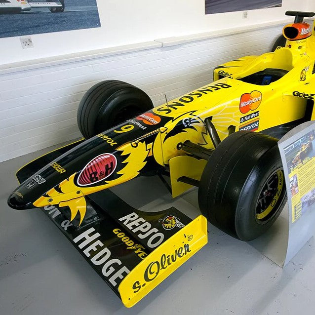
#8 — Jordan 198 "Hornet", 1998: Born from a legal workaround, became a masterpiece
The Benson & Hedges tobacco sponsorship couldn't show its logo directly on a car racing in countries with advertising restrictions. So Jordan's designers got creative. The result, an abstract yellow-and-black pattern across the entire bodywork, looked less like a sponsored racing car and more like an insect in attack mode.
The "Hornet" livery is one of the most accidental design triumphs in motorsport history. The segmented panels of yellow and black read as wing geometry at speed. Under the Belgian sun at Spa, under the grey sky at Silverstone, the car shimmered and buzzed in a way that no other livery has managed before or since.

Damon Hill won in this car at Spa in 1998, in what remains one of the most emotional victories in the sport, a world champion who had been discarded by Williams, finally winning again in a car that looked nothing like anything else on the grid.
Regulatory constraint. Creative response. Accidental genius. That's the full story of the Jordan 198.
#7 — Renault R25/R26, 2005–2006: The poster car that won two championships
There are F1 cars that look like racing cars. And there are F1 cars that look like graphic design objects. The Renault R25 and R26 were firmly in the second category.
The ING blue against the Mild Seven yellow nose created a contrast ratio so clean and deliberate it looked less like a sponsorship negotiation and more like a design brief someone actually cared about. Mid-century poster aesthetic. Maximum contrast. No visual noise. It was the most photogenic car of the mid-2000s, and it wasn't particularly close.
Fernando Alonso won back-to-back world titles in these cars, 2005 ending Ferrari's four-year domination, 2006 fought out in one of the most dramatic title battles of the modern era. The livery absorbed all of that drama.

The R25 and R26 also represent something rarer: a livery that stayed largely consistent across two seasons, two championships, and countless memorable moments. Consistency is underrated. These cars always looked exactly like themselves.
#6 — Brawn GP BGP001, 2009: White space as philosophy
The BGP001 shouldn't exist. Honda pulled out of Formula 1 at the end of 2008 with less than two months until the new season. The team's technical director, Ross Brawn, bought the assets, renamed the team after himself, lost most of the sponsors, and turned up at the first race in a car that was almost entirely white.
The fluorescent yellow-green Brawn logo on white bodywork is the rarest colour relationship in motorsport history. Most teams add. Brawn subtracted. The car was visually defined by what it didn't have, no sponsor clutter, no competing colour blocks, no noise. Just a clean machine that happened to be, by some miracle of aerodynamic development done in secret the previous year, the fastest car on the grid.

Jenson Button won six of the first seven races. He won the world championship. The team was sold to Mercedes at the end of the year.
One season. Both titles. The cleanest livery of the modern era. The most unlikely story F1 has ever told.
#5 — McLaren MP4/4, 1988: The season that redefined what dominance looked like
The Marlboro McLaren MP4/4 won 15 of 16 races in 1988. It is, statistically, the most dominant car in F1 history, a record only broken 35 years later by the Red Bull RB19. But numbers don't explain why this livery still stops people cold when they see it.
The red and white Marlboro chevron had been on McLarens since 1974. By 1988, Ayrton Senna and Alain Prost had turned the colour combination into something beyond a paint scheme, it was a statement of intent. The specific rake of the MP4/4's bodywork made the Marlboro geometry read differently from any previous season. The livery and the car shape were designed for each other.
This was also the year Senna and Prost began their war. The tension between the two drivers, teammates, rivals, eventual enemies, was played out in a car that looked like it belonged in a different category from everything else on the grid. It probably did.

The MP4/4 in Marlboro red is the first image that appears in most people's minds when they hear the word "Formula 1." That's not nostalgia. That's a livery that did its job perfectly.
#4 — Lotus 72, Gold Leaf, 1970: The car that changed everything
Before 1968, Formula 1 cars raced in national colours. Britain was green. Germany was silver. Italy was red. The identity came from the country, not the team.
Colin Chapman changed that forever when he painted the Lotus 49 in the red, white and gold of Gold Leaf tobacco, the first commercially sponsored livery in Grand Prix racing history. The sport would never be the same.
The Lotus 72 took that idea and executed it in its most refined form. The wedge-shaped bodywork, the red-white-gold-black colour blocking, the John Player Team Lotus lettering down the flanks: it looked like nothing on the 1970 grid because nothing on the 1970 grid had been designed to look like a product. The 72 had been designed to sell cigarettes. As a side effect, it became one of the most beautiful racing cars ever built.
Jochen Rindt won five consecutive Grands Prix in this car before his fatal accident at Monza. He was posthumously awarded the world championship, the only driver to win the title after his death. The Gold Leaf livery is inseparable from that tragedy.

Every sponsor logo on every F1 car since 1968 traces back to Chapman's decision to paint a racing car like an advertisement. The Gold Leaf Lotus 72 is where the modern sport began.
#3 — McLaren MP4/23, 2008: Chrome in the rain at Interlagos
Chrome is a fundamentally different material from paint. It doesn't have a fixed colour, it reflects its environment, changes under track lighting, looks different at every circuit in every weather condition. Putting chrome on a Formula 1 car was either an act of creative ambition or complete madness. Probably both.
The Vodafone McLaren MP4/23 was the first car to use chrome bodywork as a livery choice rather than a functional one, and it worked. Under the floodlights at Singapore, under the wet grey sky at Silverstone, under the Brazilian sun at Interlagos, the car looked different every time. It was the most photographed car of the 2008 season for reasons that had nothing to do with results.
Then came the results. Lewis Hamilton, in his second season of Formula 1, went to the final corner of the final lap of the final race of the season needing fifth place to win the championship. He was in sixth. He passed Timo Glock at the final corner. He finished fifth. He was world champion.

The image of that chrome car in the rain at Interlagos, surrounded by chaos, is one of the defining photographs of modern Formula 1. The livery became the visual memory of that moment.
#2 — JPS Lotus 79, 1978: Black and gold — the untouchable standard
If you asked every serious F1 fan to name the most beautiful livery in the sport's history, a majority would say this one. The John Player Special black-and-gold scheme appeared across 15 different Lotus cars over 15 years. It outlasted the team's competitive peak, outlasted its title-winning era, outlasted several different ownership structures. Fans simply refused to let it go.
The physics of it are straightforward: black absorbs light, gold reflects it. The combination creates depth and contrast that no other two-colour pairing has replicated at speed on a racing car. Under floodlights, under the Monza sun, in photographs taken 45 years ago, the JPS Lotus looks exactly like itself. It doesn't age.

The Lotus 79 specifically — Mario Andretti's 1978 championship car — was also the most aerodynamically advanced machine of its era. Colin Chapman's ground-effect concept generated downforce through the underbody for the first time, and the Lotus 79 exploited it better than anything else on the grid. Andretti won the championship. Ronnie Peterson, his teammate, was killed at Monza. The season ended in tragedy.
Black and gold absorbed all of it — the genius, the dominance, the grief. It's not just a great livery. It's the livery that proved a paint scheme could carry the entire emotional weight of a sport.
#1 — Ferrari Scuderia — not a livery, an identity
Every other entry on this list is a specific car in a specific season. The Ferrari entry cannot be a single car. That would miss the point entirely.
Ferrari is the only team in Formula 1 history that has never fully surrendered its identity to a sponsor. Marlboro was on the car for decades. Philip Morris, Shell, Vodafone, Santander, Mission Winnow — sponsors have come and gone, changed name, been banned, come back in abstract form. Through all of it, the car has remained red. Not because red is the best colour for a racing car. Because Ferrari decided, somewhere in the middle of the last century, that their cars would always be red, and they have simply never changed their minds.
Rosso corsa, racing red, is a specific shade. PMS 485. It predates modern motorsport branding by decades. It predates Formula 1 entirely. It was Italy's national racing colour before the war, worn by Alfa Romeo and Maserati and the early Ferrari sports cars. When the Formula 1 World Championship began in 1950, Ferrari arrived in red. They have never left.
The test of an iconic livery is whether it still looks right 30, 40, 50 years later. Ferrari red passes that test in every decade. There is no version of the future in which a red Ferrari looks wrong. That permanence is something no other team has achieved, and no other team could achieve, because you cannot copy an identity — you can only build one over 75 years of unbroken presence.
Everything else on this list is a great livery. Ferrari red is a religion.

Legendary 3-pack - Michael Schumacher skateboards as wall art
What makes a livery last?
Pull the thread across all 10 cars and the common factors become clear. Simplicity. Contrast. Cultural embedding through performance. The liveries that die are the ones designed by committee to satisfy a sponsor's brand guidelines and no one else. The ones that endure were made with some conviction about what a racing car should actually look like.
The JPS Lotus didn't need eight colours. The Brawn GP didn't need a sponsor. The Ferrari doesn't need to change. The best liveries know what they are and refuse to apologise for it.
There's a reason these cars end up on bedroom walls rather than just YouTube compilations. A great F1 livery is a graphic design object first and a racing car second, and when you take it out of context and put it somewhere it can be properly seen, that becomes obvious fast.
That's exactly what the Deckorate motorsport collection is built around. Explore the full collection →